Product Guidance Mission
I led on browsing guidance mission at Farfetch as product Designer, I’ve worked jointly with PO’s, Engineering, UX research and Data Analytics to shape our continues road map based on context, data and team confidence.
Before I’ve got assigned to the mission, there has been a re-design for the PLP/PDP pages, the A/B test for the re-design took months to stabilise, as a team, we were aware many pain-point and areas that require improvement.
“As a customer, I want an elevated and thoughtful experience, so I can browse, compare and assess products and services intuitively.”
Based on the new mission we ran a workshop as a team with objectives of:
1) Revise the Status Quo
2) Share knowledge from Data and experts
3) Understand customer pain points
4) Identify opportunities
5) Priorties Intitaives based on team confidence
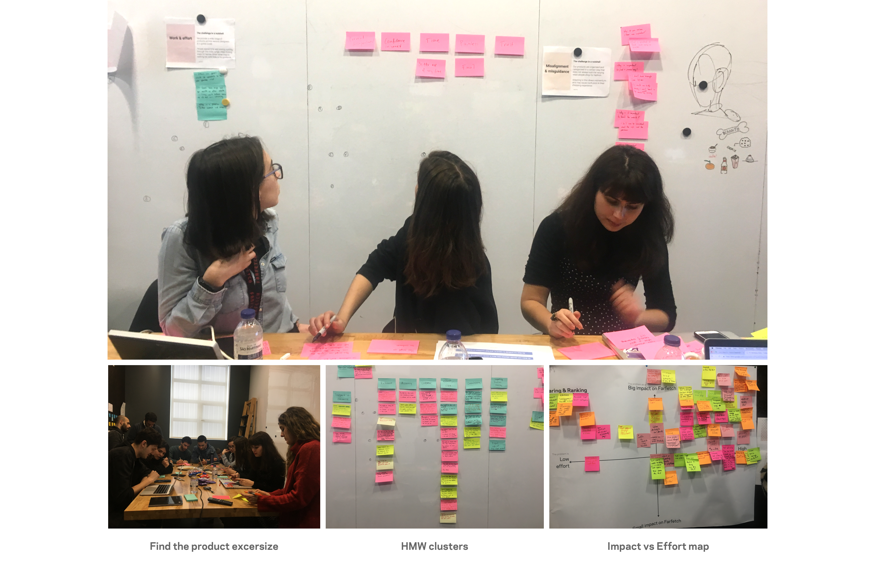
Workshop Outcome
In the workshop, we had status quo playback, followed by re-org / new mission objectives and accompanied by hopes and fears exercise. then we had a review for what we know based on Quan. & Qual. from UX researcher And Data Analytics teams and other experts.
We generated HMW from the identified customer pain points, ideated and clustered based on value and impact matrix. after the workshop, I’ve segmented the initiatives based on themes to have more clarity where team confidence resides.
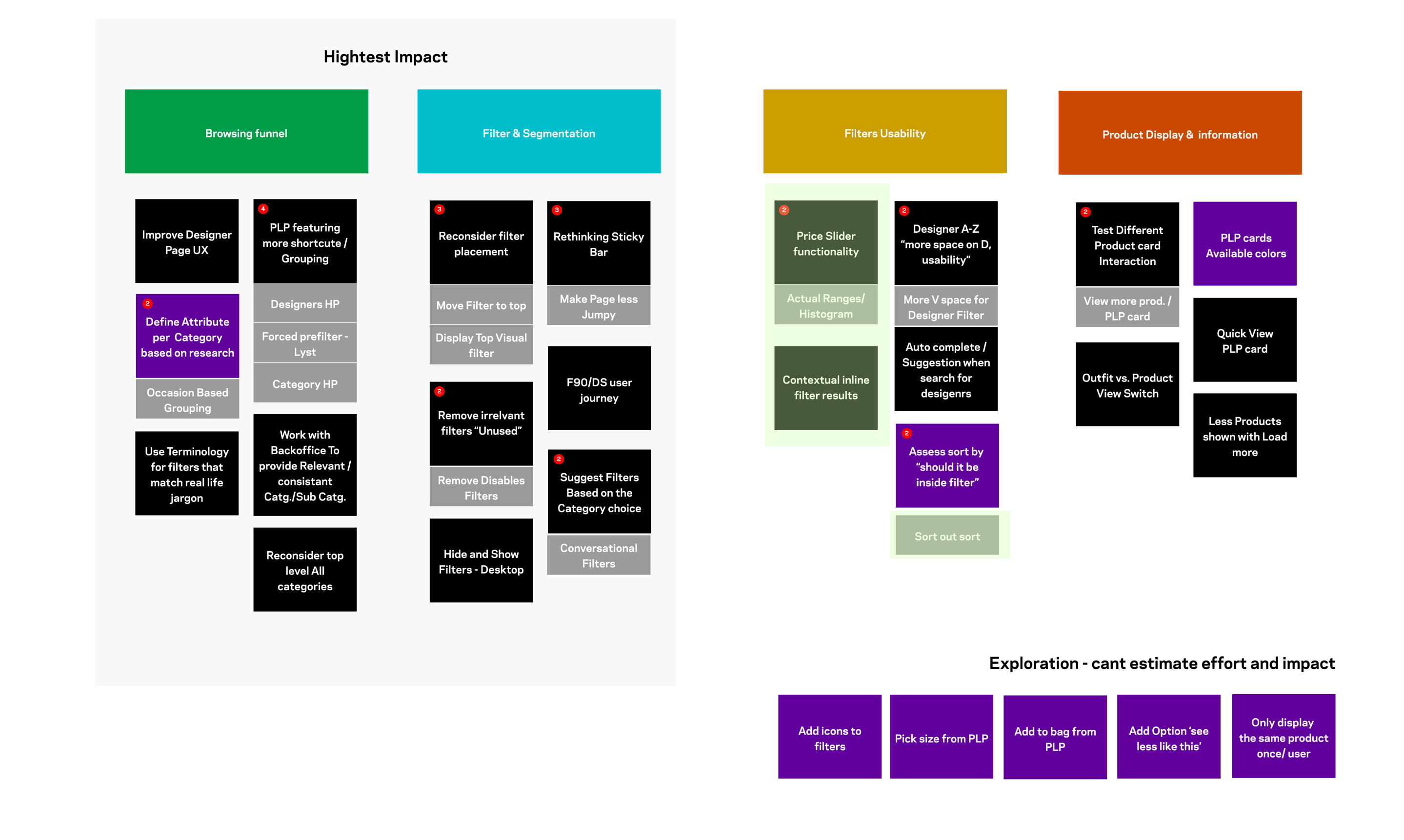
These are some of the initiatives that resulted from the workshop, explaining my design process to drive hypothesis from clear problem statements, The ideation toolkit used in each, and validation process.

Surfacing subcategory
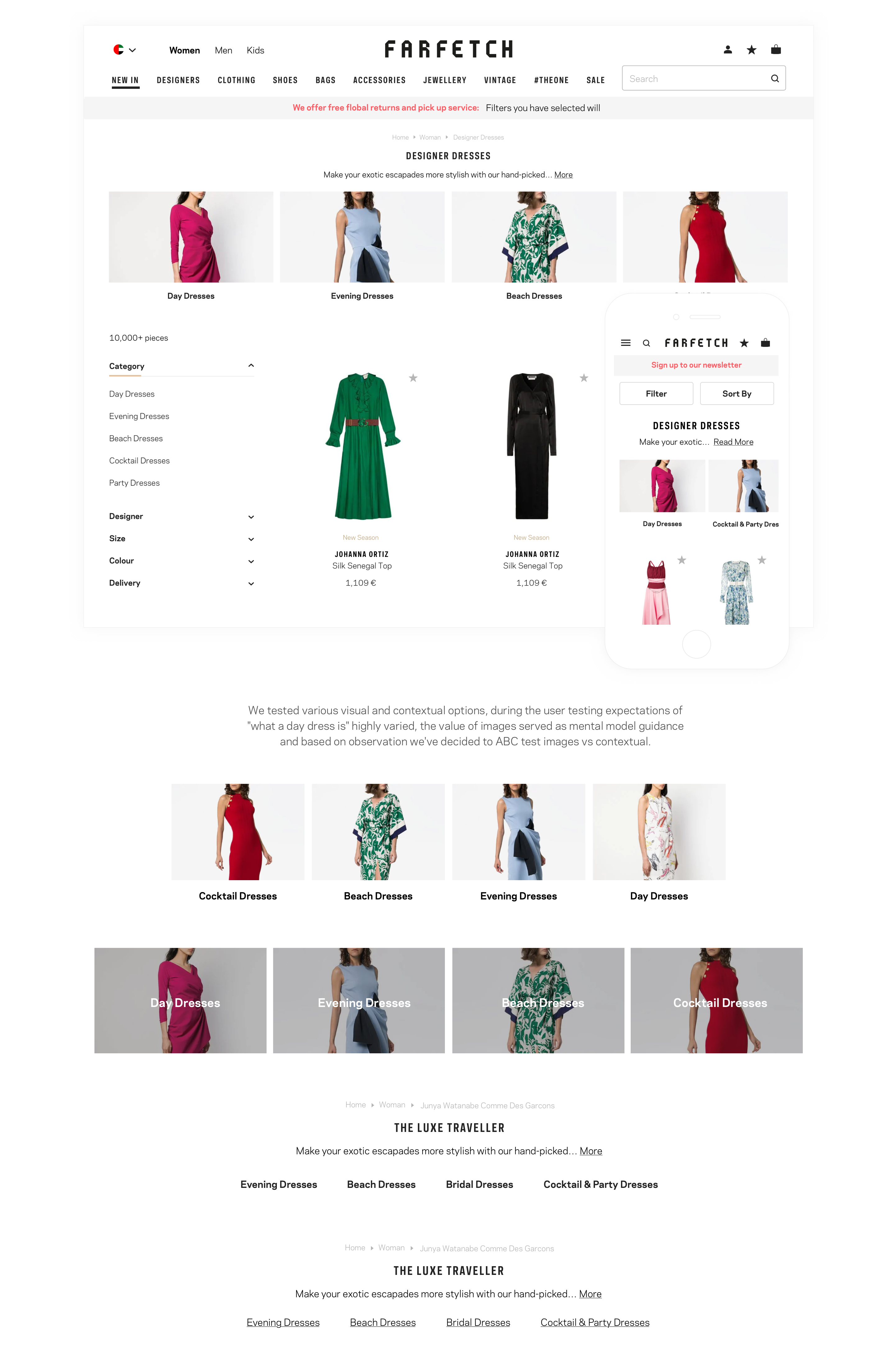
Context setting — The browsing experience at Farfetch has been described overwhelming, customers regularly referring to a large number of products displayed in the product listing pages. Work and effort is a captured theme in multiple user testing, another observation, the use of filters as a tool to reduce the number of products instead of finding the desired one.
Based on Quan. Data — 90% of all Listing Page visits made in only 18% of the total existing Listing Page types, and only 1/3 of our customers’ use filters.
A mix between desk research and previous findings “UX research pilot categories vs attribute” shaped a clear understanding of the problem space.
In the UX research pilot “categories vs attribute”, users have been presented with two experiences. In the first one, the filters included both categories and attribute, in the second, filters included only attributes by showing categories as a separate entity.
Though the customers didn’t state any clear preference, in the second experience, they managed to complete tasks faster with higher certainty.
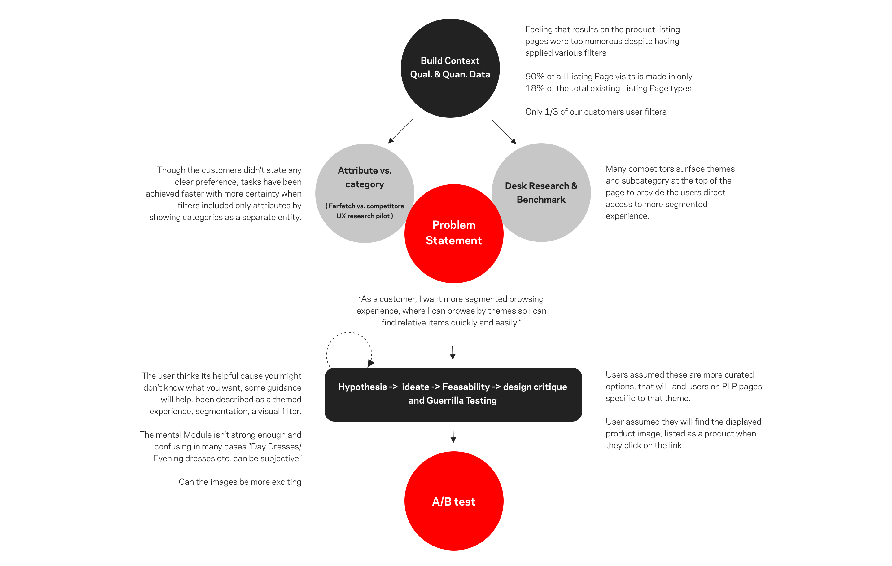
Based on the insights we drafted our Problem statement — “As a user, I want more segmented browsing experience, where I can browse by themes so i can find relative items quickly and easily”
Our Hypothesis: By surfacing subcategory with the highest GMV/Visits at the top of the PLP section, Subcategories that customers won’t be able to access directly from our mega nav such as “Day Dresses, Evening Dresses… etc”, our customers will have more comprehensive browse experience based on themes, which might reduce effort to find desired items.
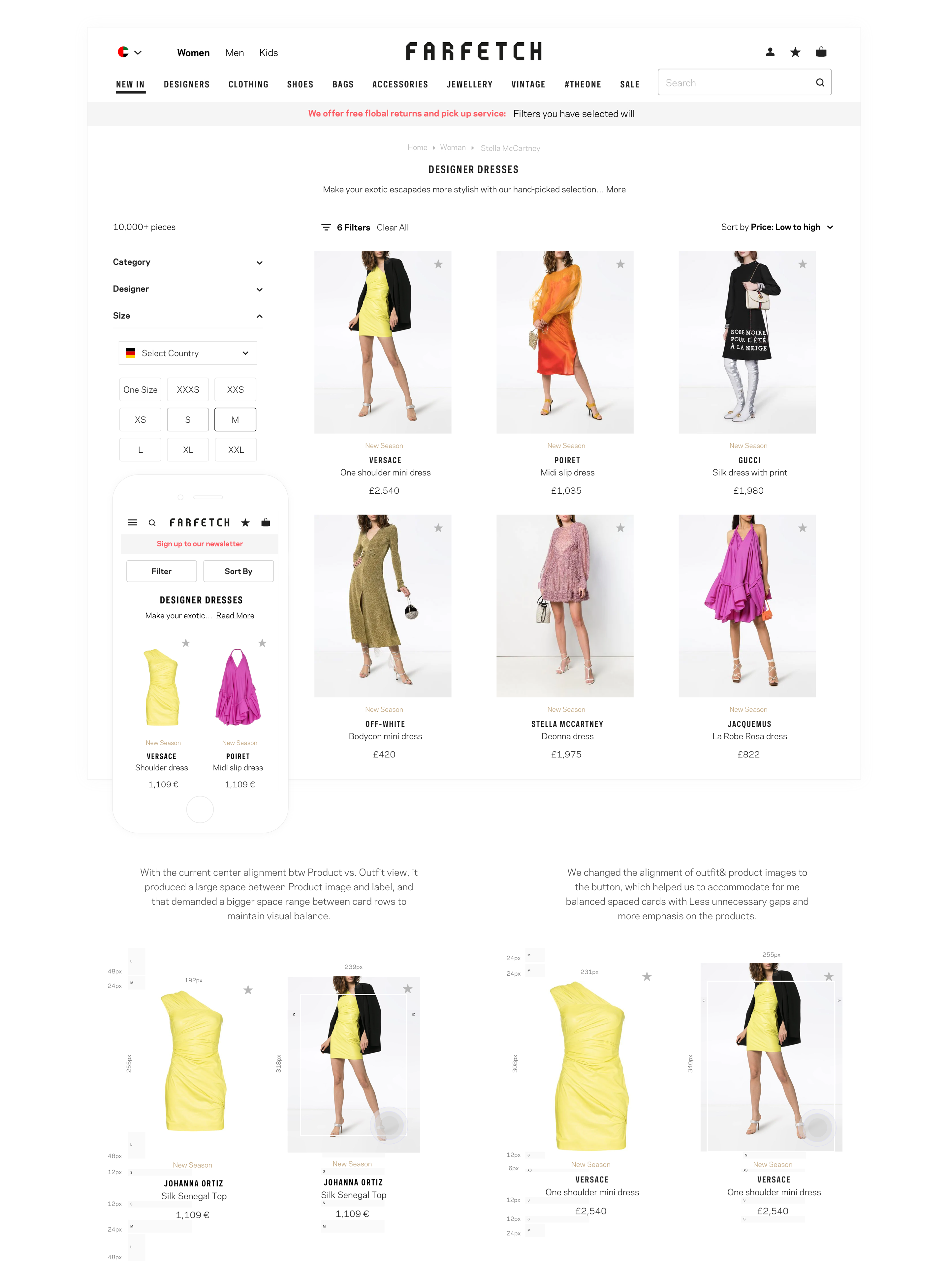
Product Card Autonomy
“As a customer, I would like to capture as many details as possible of the product at an early stage, so I can make a more informed decision about which products I want to explore further.”
User pain-point: The images on the listing pages are too small, not many details are captured, and it doesn’t look inspiring enough.
Hypothesis, by re-visiting the product card structure, we can maximize the use of the product cards to create more emphasis on the product display and more inspiring experience for our customers.
Gender Toggle
The initial problem that we want to tackle was the high bounce rate in the Mweb experience for CPC/google search traffic. And for us to understand the cause of high bounce rate, we’ve worked with the UX research team to understand customers behaviour coming from search engine results.
We ran a user story on usertesting.com, directing users from search to Farfetch in the intent to shop for a particular shoe brand. As Farfetch has no genderless PLP pages, a male user might end up on PLP page listing female products. “This site is not for me and only sells female products, some of users’ feedback, other users checked filters to see if they can filter by gender, only one participant was willing to use the main navigation to re-navigate”
And based on our observation, we came up with our problem statement and Hypothesis.
“As a prospect customer coming from search, I want an easier way to find the product offer of each gender, so I won’t assume that Farfetch has no items for me.”
User Problem: Prospect users are not immediately clear on how to switch between men and women’s products when they land on Farfetch, Male customers assumed that Farfetch only sells women’s products.
Our Hypothesis: By providing users coming from search with more contextualized experience and immediate access to switch the PLP gender, we will decrease the bounce rate and one-page visits.
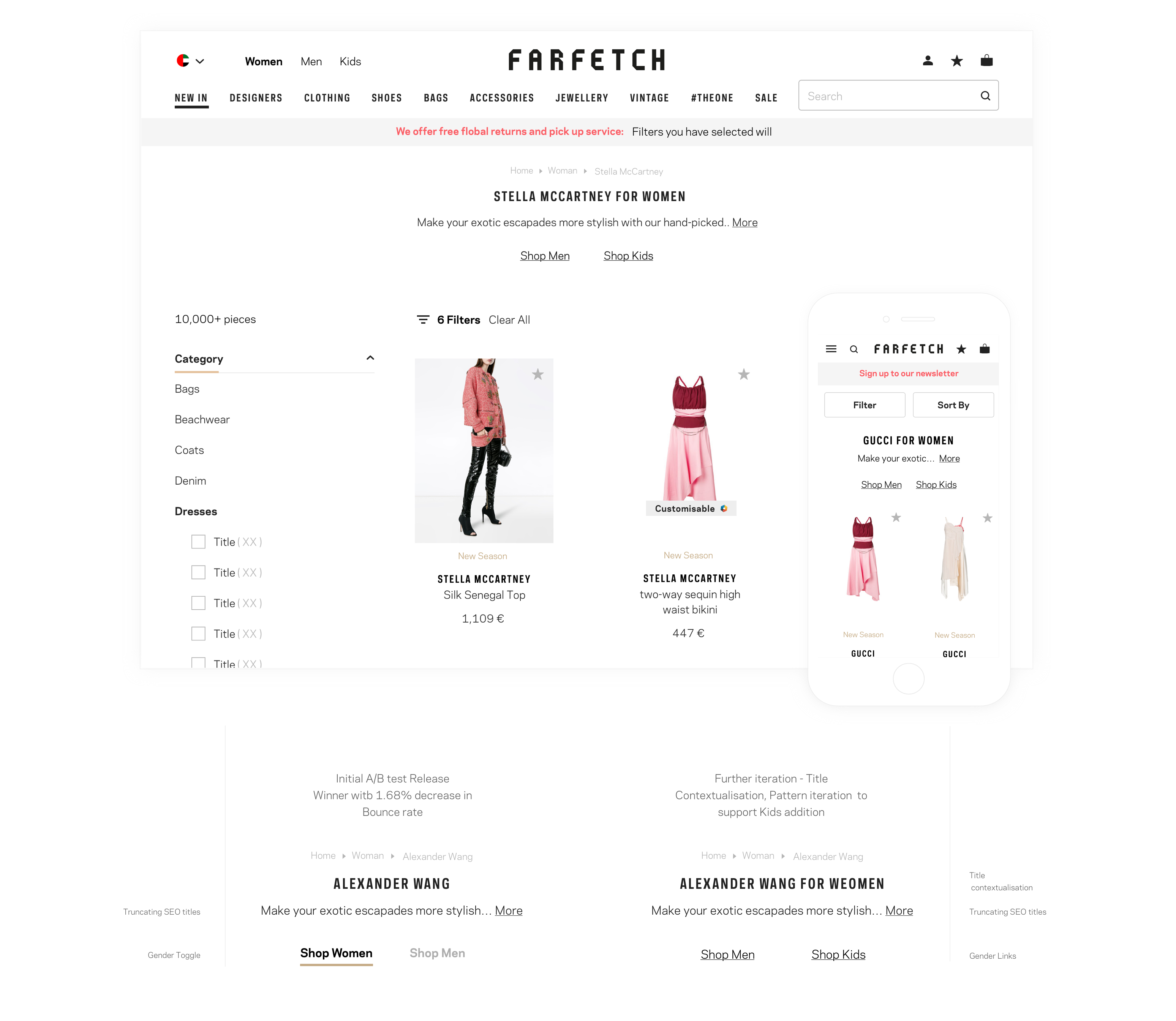
We’ve worked with the SEO team to make sure PLP titles are contextualised “For Example instead of Gucci, its Gucci for women” as well we gave the users the ability to switch the PLP to shop for different gender.
We had to align with the design system team on the switch pattern, as well we ran a few iterations of user testing to ensure the clarity of the solution and used terminology.
The results of this A/B test came back with a significant decrease in bounce rate, high uplift in CTR and a substantial increase in CR.
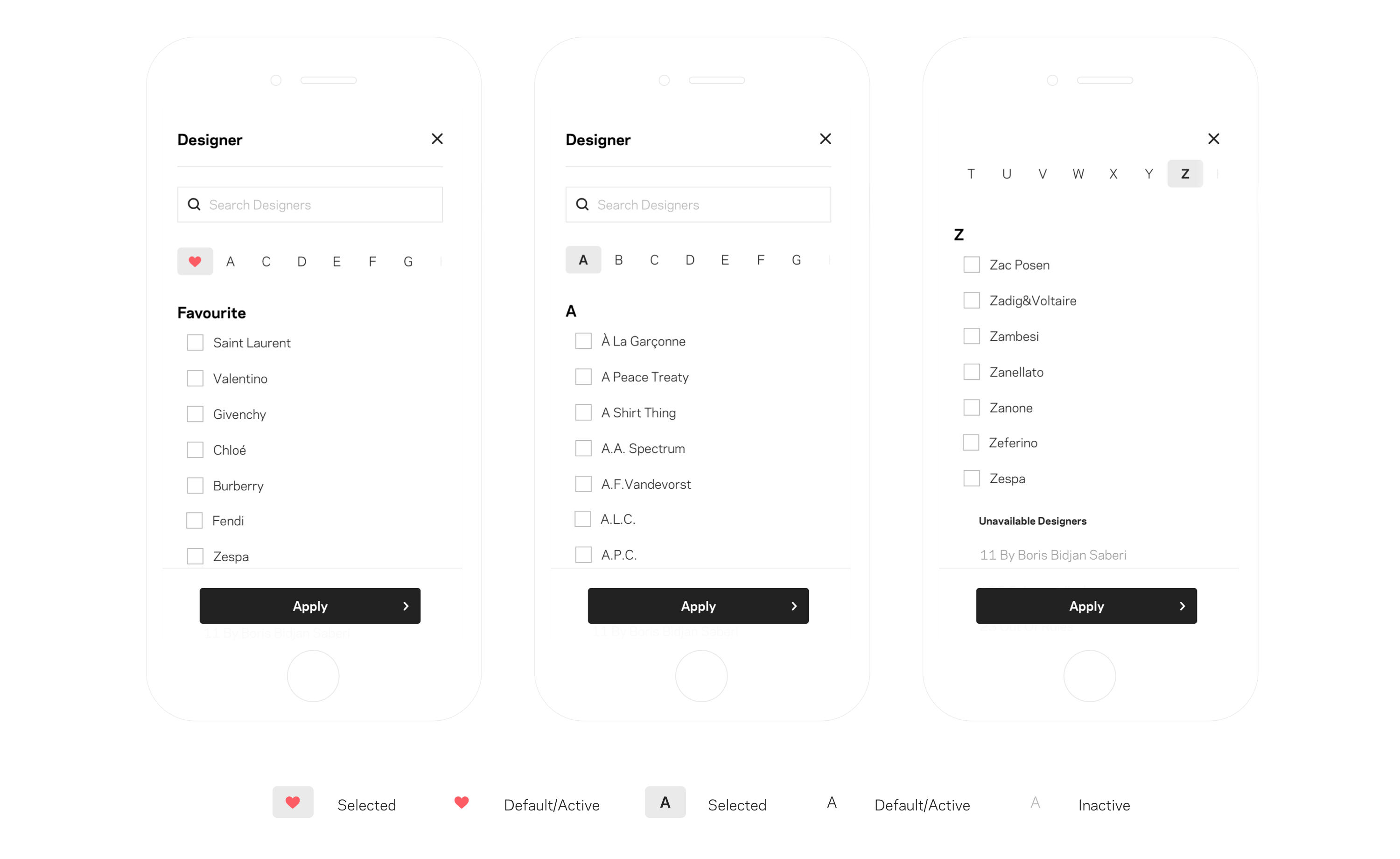
Designer A-Z Bar
“As a user, I want an intuitive and efficient filter experience, so I can find my desired designer immediately and effortlessly.“
User Problem: User finds it time-consuming to go through the Designer filter, and as a result, there is Difficulty in finding the designers of choice efficiently and quickly.
and our Hypothesis: By providing users with A-Z bar on the Mweb filter experience, users will be able to find a designer of choice quickly by tapping on the letter instead of scrolling.
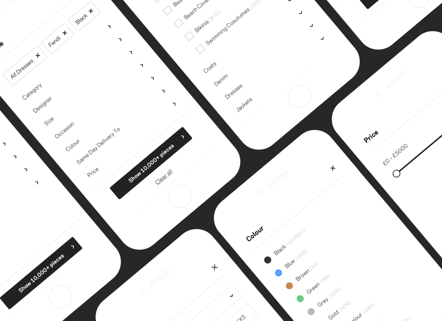
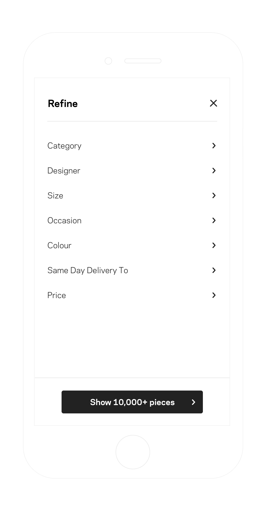
Mweb Filter UI & Interaction
Context setting — After the redesign of the product listing pages and change filters pattern on Mweb from one page to multi-screens, the data reflected a drop in how many filter customers apply which raised questions in regard of the effectiveness of the new pattern.
Pain-point Library and user testing session showed some uncertainty in Multi-page filters experience.
customers described interacting with filters on Mweb a bit confusing, not sure about the flow of the screens, which increased uncertainty if the selection of been applied or not.
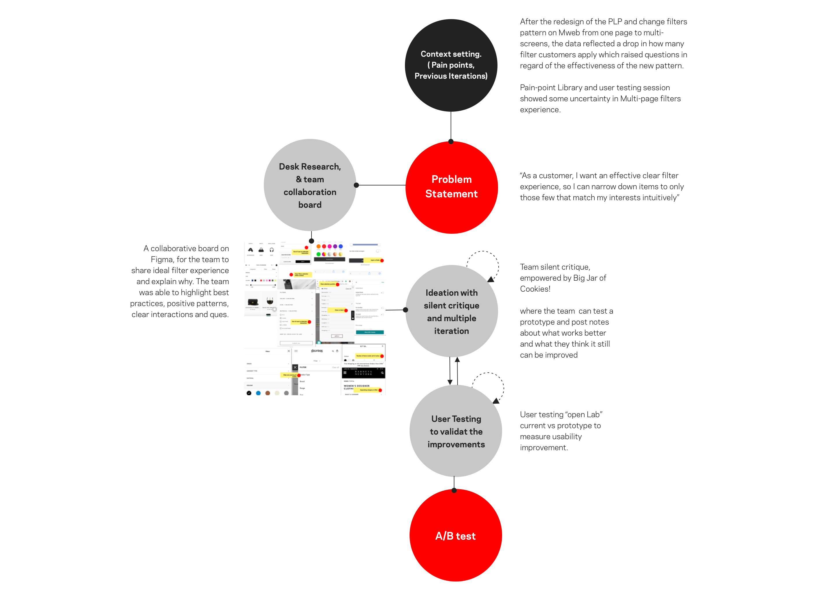
“As a customer, I want an effective clear filter experience, so I can narrow down items to only those few that match my interests intuitively”
Our Hypothesis, by maximizing the flow by using cues, improve the usage of the screen and emphasis on information hierarchy, we will improve affordance and reduce uncertainty.
In this test, we’ve decided as a team not to redesign filters again, but instead, we want to elevate the experience to the next level.
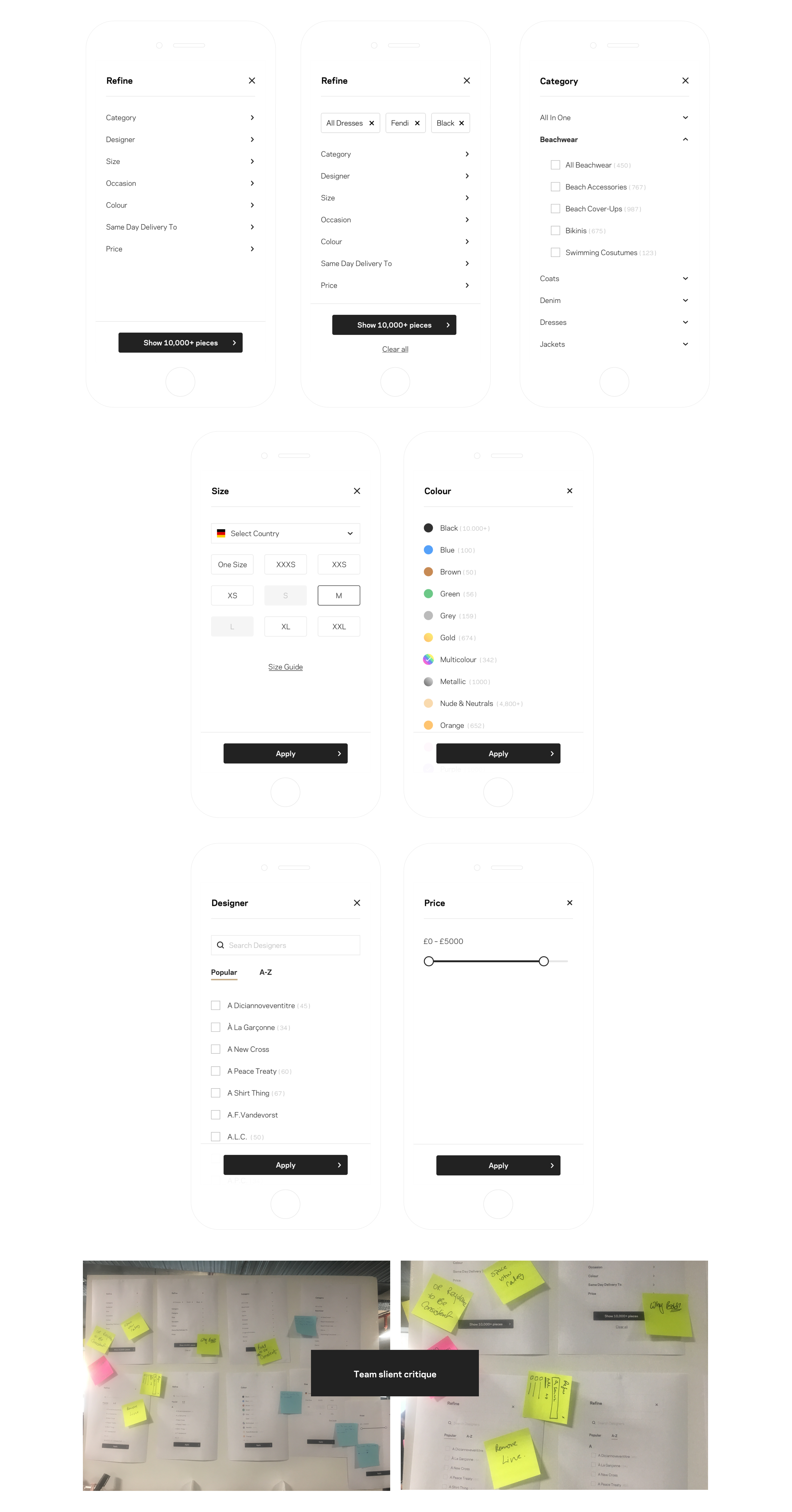
I had desk research initially, to gather best practices from Baymard and other references, and bench-mark with other direct/indirect competitors. Then I’ve set up a collaborative board on Figma, for the team to share ideal filter experience, highlight positive patterns, and clear interactions.
From there, I’ve worked on the first iteration, ran a silent critique with the team from them to review prototype and feedback to iterate further. We had open lab user testing to validate our hypothesis and gather further insights.
The new version is the current live version, where it proved through A/B test positive results, on filter usage, CR & CTR.
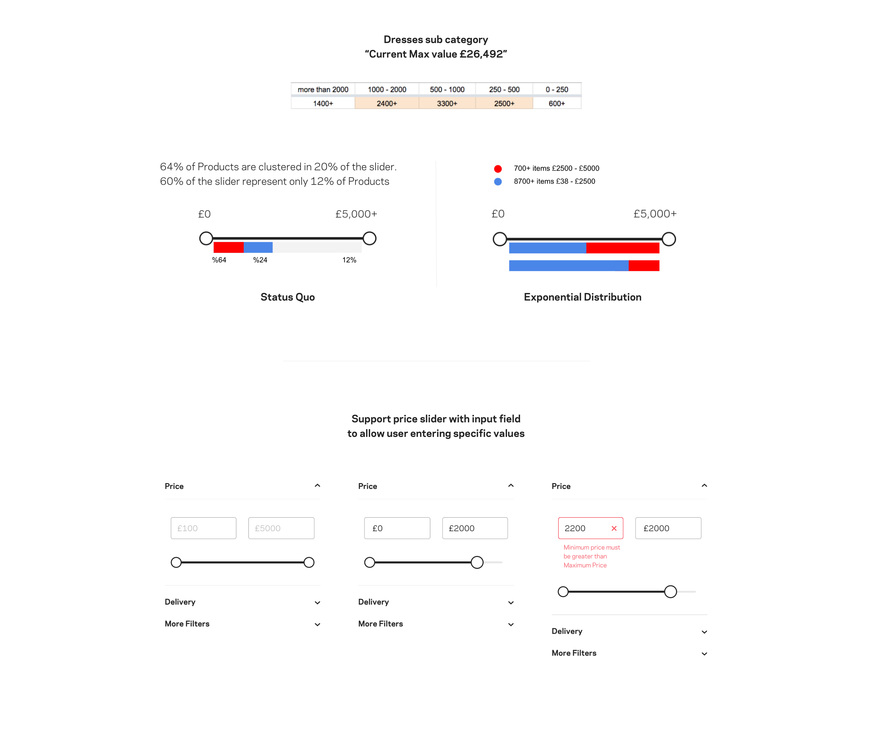
Price Slider
Context setting — In a previous iteration, when the team redesigned the PLP page, the pattern of the price filter redesigned from input fields to slider pattern. The new slider had positive results on Mweb, but underperformed on Desktop, comparing to old PLP input based UI.
When we looked into how users interacted with the new pattern, Users found it’s hard to define specific values, while others mentioned the low impact on the number of results.
The slider presented a default range from £0 – £5000+; the value based on overall avg across all categories, and it was designed to be linear “The entire range is broken into a set of equivalent ranges”.
My exploration was to understand how that default range with a linear pattern is effecting individual category. For example, in Ballerina category, most items clustered between values of £250-£1000, as a result interacting with 80% of the slider would reflect a minimum change in results if any at all. And that makes the slider needlessly sensitive in the £250-£1000 range.
Based on the above and looking into slider pattern best practices, we came with our problem statement to define the desired outcome, and Hypothesis on how can improve interaction and the results.
“As a customer, i would like be able to filter easily by specific budget, so i can browse items that i can buy.”
Hypothesis #1 ‘Non linear scale’: Using “Exponential scale/ incremental scales” to assign 50% of the scale to the common price range “based on avg. pricing distribution” will improve filter usability.
Hypothesis #2: Associate the price filter slider pattern with input fields will enable the customers to set specific price values, driving the filter usage up.