

Farfetch Arabic Localisation Project
Benchmark and Define MVP scope
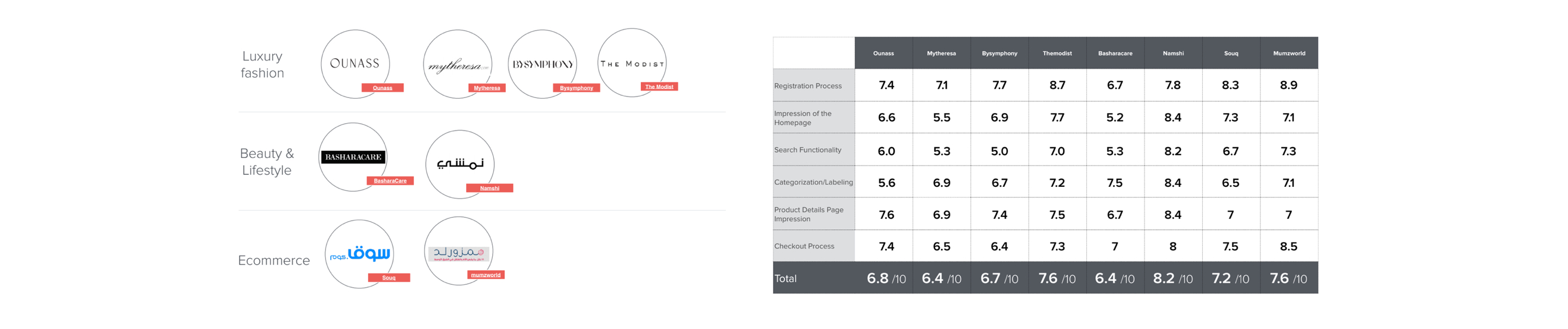
Working closely with research partners to establish an understanding across teams for Market requirement, Design Guidelines including typography, iconography, layout interaction, nation-state, and user competitor benchmarking.
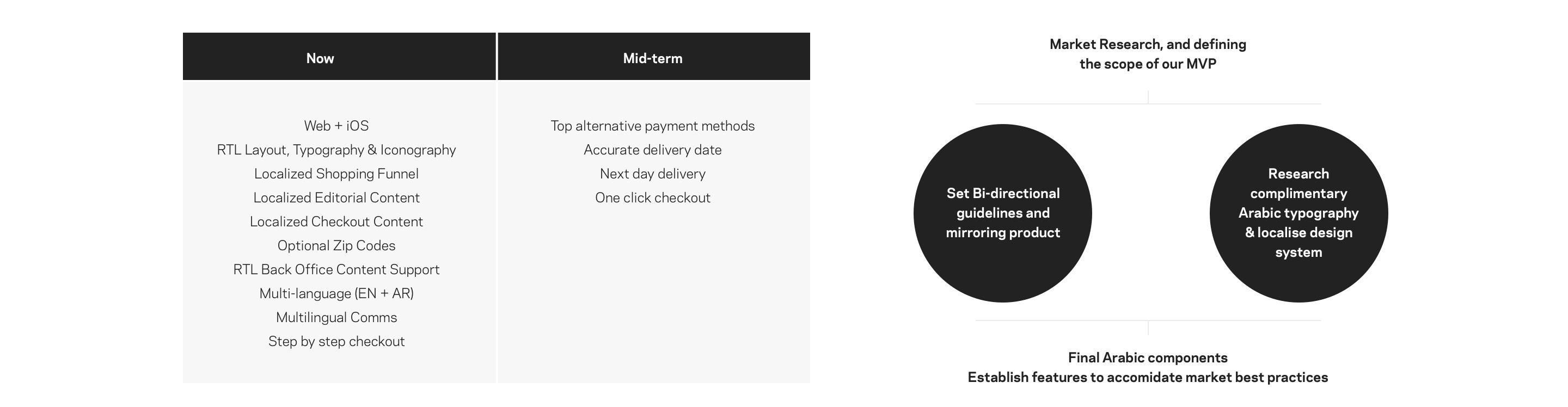
The research finding and the benchmark were the foundation to define our MVP, and break our vision into Now, Mid-term strategy.

Mission & what we want to achieve
“Go live before April 2018 with Localized UI, Multi-language support & Local CS + VIP service levels”.
Our Mvp included Establishing Bi-directional foundation that includes Typography & localized designed system, Localised UI for both Web & IOS, Multi-Language support, Address system adaptation, Localised Editorial, and Multilingual comms.
Establishing the Foundation
To establish the foundation, we had to work in parallel on setting Bi-directional guidelines, and looking into the Arabic Typography/Localised Design System, based on design research and our expertise as a BIDI foundation we’ve started Mirroring features to ensure progress while working on Typography sign off.
Arabic Typography
As the Arabic calligraphy has different characteristic, it was important to ensure the selected font has various styles to accommodate for the current product/component typography structure. We’ve researched and tested various Modern Arabic fonts on 3 phases of iteration, the criteria of selection based on.
Legibility & Readability, Arabic characters have overhanging & looping features that could influence legibility, our first criteria was a modern font, highly legible and readable on small screens. Structure and Hierarchy support, Arabic calligraphy has a different characteristic compared, to bridge the gap we needed a type with various weights to support product/component Hierarchy. Brand tone of voice, we aimed for Arabic type with high adjacency to Latin“not only in hierarchy and structure” but as well in look and feel.
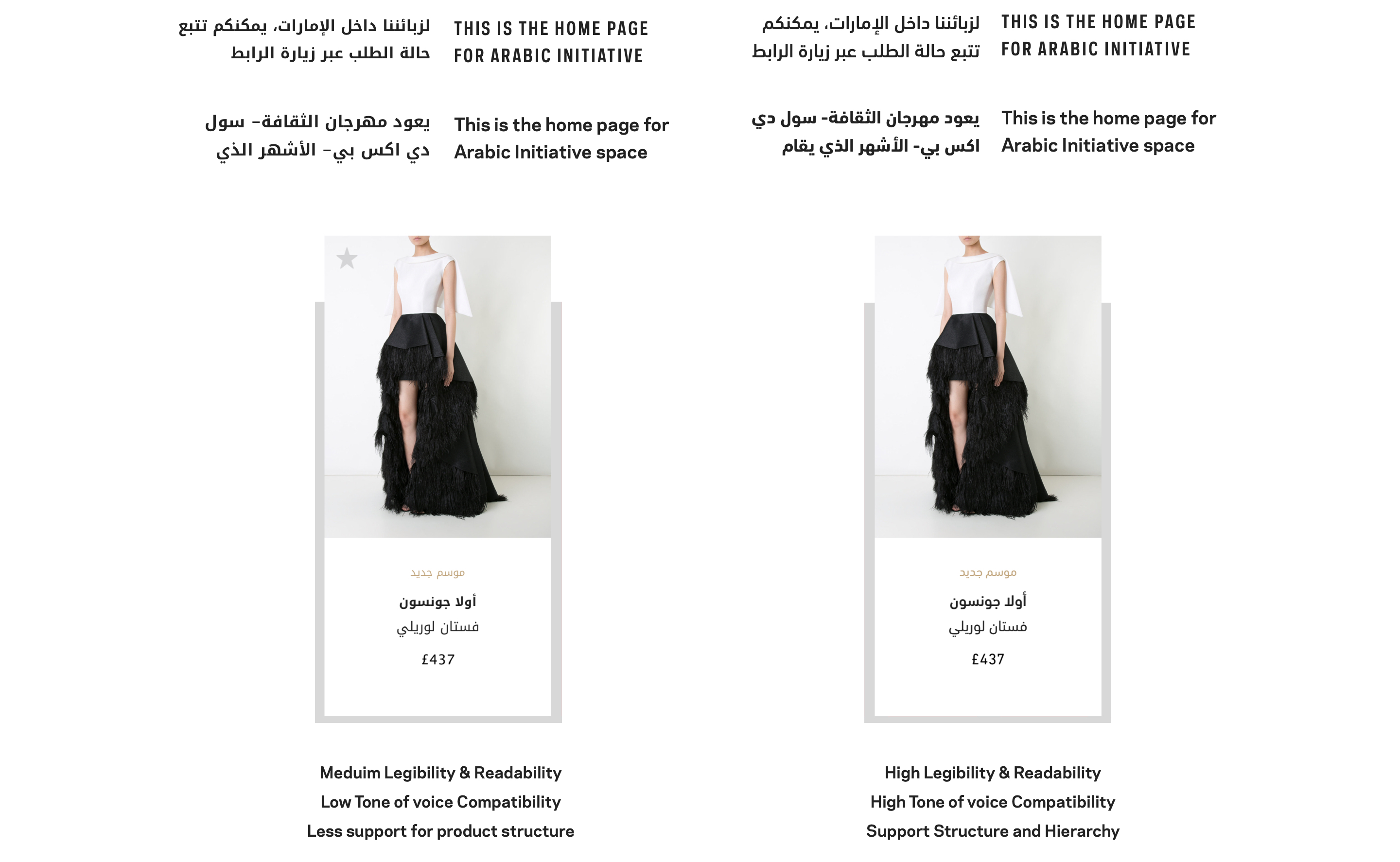
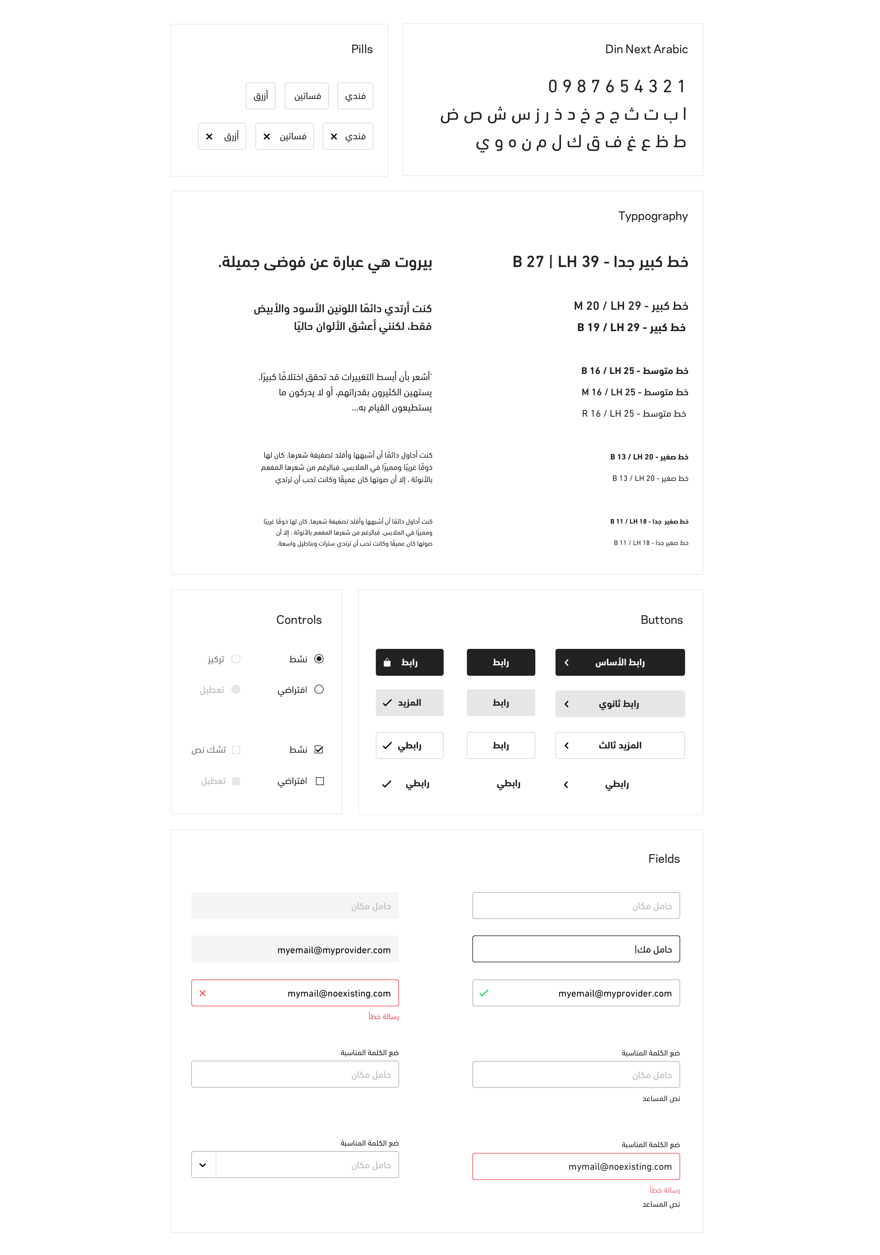
Din Next Arabic, After various iteration and testing, Din Next Arabic was the selected type. the font is a clean hybrid of Kufi and Naskh structures with mono-linear curve style, it has a similar autonomy to Farfetch Latin type which made it a good companion that reflect the right personality.
Localizing Design System & Font Mapping
Once we signed off and licensed Din next Arabic, we’ve started to map various libraries across multiple platforms, establishing equivalent line-height after a few iterations of testing “Arabic calligraphy requires larger line-height”.
And because the localized project fell in the middle of the design system update, we had several libraries to work on. “Design system library, Legacy, system font on some of the App old sections ‘San Fransisco'”.
Then we moved on localizing and mirroring the UI Kit, and design system library.
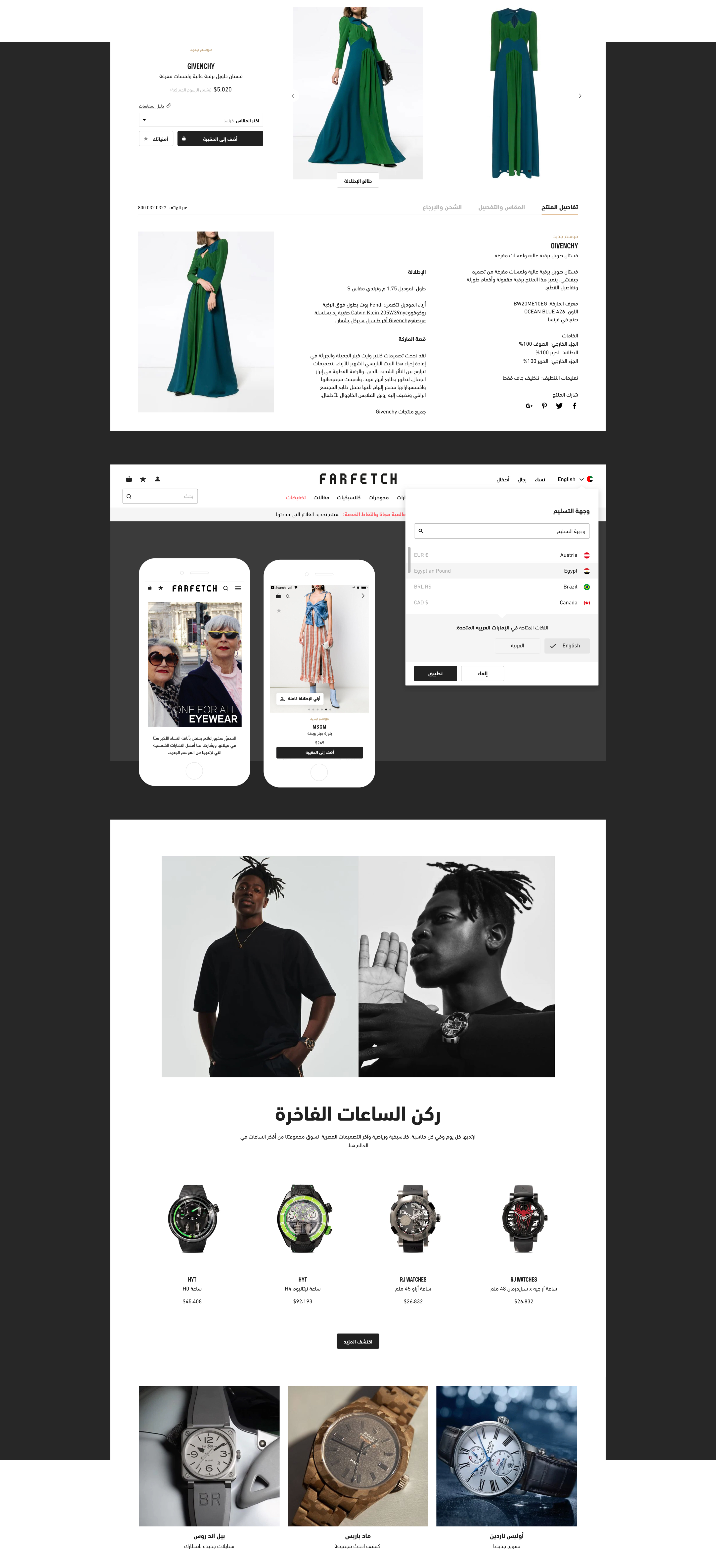
Final Arabic Designs
At that point, We had most of the components mirrored and shared it with Devs, Full typography mapping and localized Arabic design system. Our next step was to put the pieces together and start delivering final critical designs for various Web and App team.
We’ve worked with the content team to make sure translation fits in context (i.e long translation in navigation) and we’ve iterated on some of the features to support Market Best Practices, like support multi-language experience, language preference for various user journeys, support Hindu Numbers, and address system in checkout.
QA process
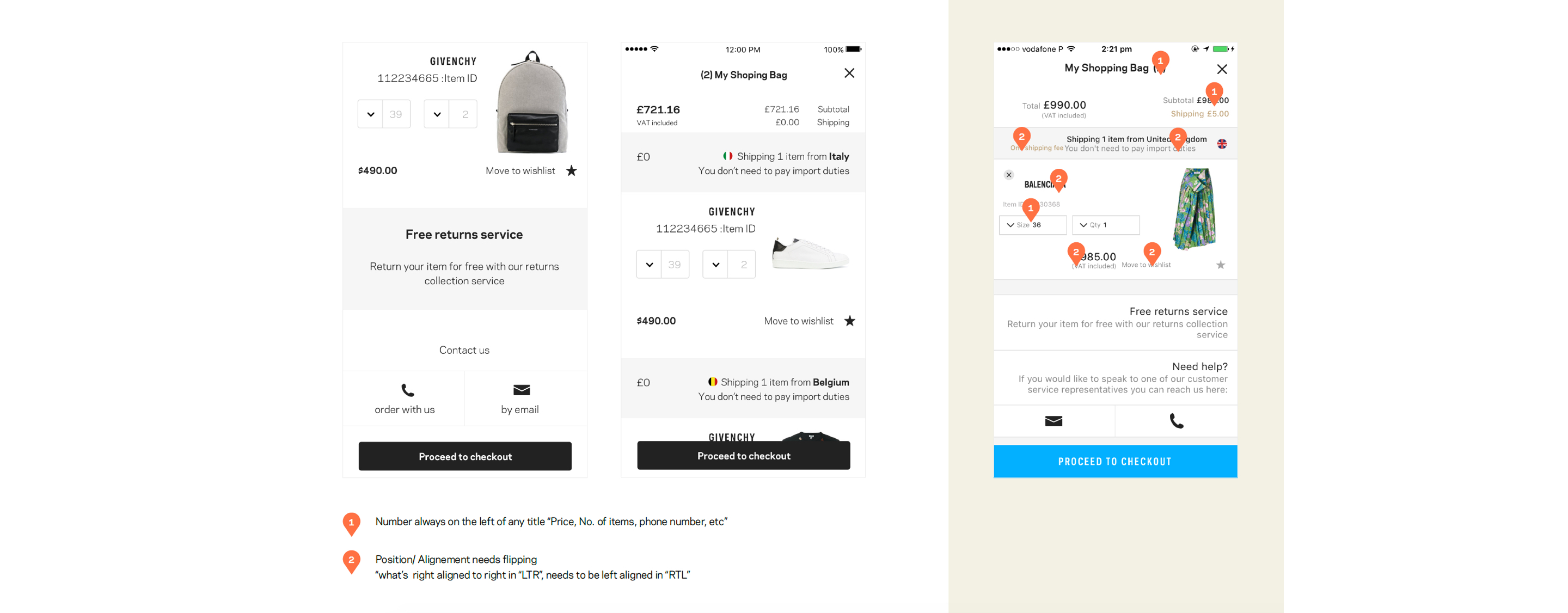
1) Auditing at the stage of Layout flipping. 2) An audit that included content and typography
Daily design audit with the Web and App teams on testing environments ahead of launch to tackle any issues & Blockers for the holistic experience.
User Testing
Work with UX research team on end to end user testing for both Web and IOS to make sure the experience fit into Arabic users preferences, the main to Objective was
1) Ensure there are no blockers prior launch. 2) Feedback all finding to the business.
The initial User testing took place in London “First Generation Arabic speaker” for both platforms Web and App, covering end to end experience as well Linguistic, Imagery use, Delivery.
After Launch We’ve conducted user testing in 3 major Arab countries“Dubai, Saudi Arabia, and Kuwait”, to refine our experience for the Arabic users with a focus on Payment Methods, Search, Delivery/address systems, relevancy in our content”.